- 94 Actual Exam Questions
- Compatible with all Devices
- Printable Format
- No Download Limits
- 90 Days Free Updates
Get All WGU Applied Algebra FXO2 PFXP C957 Exam Questions with Validated Answers
| Vendor: | WGU |
|---|---|
| Exam Code: | Applied-Algebra |
| Exam Name: | WGU Applied Algebra FXO2 PFXP C957 |
| Exam Questions: | 94 |
| Last Updated: | August 22, 2026 |
| Related Certifications: | WGU Courses and Certifications |
| Exam Tags: |
Looking for a hassle-free way to pass the WGU Applied Algebra FXO2 PFXP C957 exam? DumpsProvider provides the most reliable Dumps Questions and Answers, designed by WGU certified experts to help you succeed in record time. Available in both PDF and Online Practice Test formats, our study materials cover every major exam topic, making it possible for you to pass potentially within just one day!
DumpsProvider is a leading provider of high-quality exam dumps, trusted by professionals worldwide. Our WGU Applied-Algebra exam questions give you the knowledge and confidence needed to succeed on the first attempt.
Train with our WGU Applied-Algebra exam practice tests, which simulate the actual exam environment. This real-test experience helps you get familiar with the format and timing of the exam, ensuring you're 100% prepared for exam day.
Your success is our commitment! That's why DumpsProvider offers a 100% money-back guarantee. If you don’t pass the WGU Applied-Algebra exam, we’ll refund your payment within 24 hours no questions asked.
Don’t waste time with unreliable exam prep resources. Get started with DumpsProvider’s WGU Applied-Algebra exam dumps today and achieve your certification effortlessly!
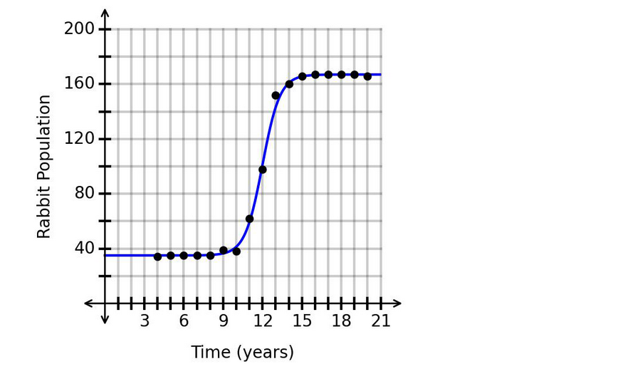
The number of members of a religious organization can be modeled using the logistic function , where represents the number of years since the organization was started and represents the number of members. The graph of is shown.

What is one range of values for which the graph is concave down?
The graph is a logistic growth curve.
A logistic growth curve has two main concavity regions:
and
From the graph, the function increases faster and faster until about:
After , the graph continues increasing, but it begins to flatten out. That means the number of members is increasing slower and slower.
This is concave down behavior.
Therefore, one interval where the graph is concave down is:
So the correct answer is:
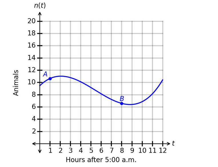
A team was assembled at a manufacturing plant in order to boost productivity. The team was tasked with producing as many widgets each day as possible. The results are shown in the graph.

What is the correct interpretation of the average rate of change from day 6 to day 14?
The graph models the number of widgets the team can produce each day.
The horizontal axis represents:
The vertical axis represents:
The graph gives two labeled points:
and
The average rate of change is:
Substitute the values:
Rounded to the nearest tenth:
This means the team increased production by an average of approximately:
Therefore, the correct answer is:
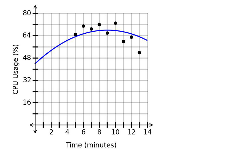
The scatterplot shows data on the usage of a computer's CPU over time. The graphed regression function has an value of .

What is the appropriate range of -values for extrapolation?
The value measures how well a regression model fits the data.
Here:
This is a low value, meaning the model explains only about:
of the variation in the data.
That indicates a weak fit. When a model has a weak fit, using it for extrapolation is not reliable because predictions outside the data range may be very inaccurate.
Since:
the best conclusion is that extrapolation is not appropriate because the regression model does not fit the data well enough.
Therefore, the correct answer is:
The function models the number of subscribers to a virtual newsletter over time. The graph of is shown. The horizontal axis represents the number of years since the newsletter started, and the vertical axis represents the number of subscribers, in thousands.

How is the number of subscribers changing over time based on the graph?
The graph shows an increasing exponential curve.
The number of subscribers is going up as time passes, so the function is increasing.
Also, the graph becomes steeper as time increases. This means the rate of increase is getting larger.
So the number of subscribers is:
This is a key feature of exponential growth.
A vehicle is traveling away from a town at a fixed rate. After 1 hours, the vehicle is 200 miles from the town. After 4 hours, the vehicle is 395 miles from the town.
Which function represents the distance, , between the vehicle and the town after hours?
Because the vehicle is traveling away from the town at a fixed rate, the distance can be modeled by a linear function:
where:
and
We are given two points:
and
These mean:
After hour, the vehicle is miles away.
After hours, the vehicle is miles away.
First, find the rate of change:
So the vehicle is moving away from the town at a rate of:
Now the function has the form:
Use the point to find :
Therefore, the function is:
Check using :
Security & Privacy
Satisfied Customers
Committed Service
Money Back Guranteed